Mabinogi World Wiki is brought to you by Coty C., 808idiotz, our other patrons, and contributors like you!!
Want to make the wiki better? Contribute towards getting larger projects done on our Patreon!
Question and Answer/Archive3
This is page 3 of an archive of questions asked on the wiki's Q&A page. It contains questions 51-75.
Q51 Shadow Missions
Okay, it's about time we started getting specific information for Shadow Missions. Some background: each mission has 4 difficulty levels (like dungeon difficulties) but overall the mission is still the same. So, I think we can put the info for all 4 difficulties on the same page. Juff has started getting us some info (link here) and started a few pages for quests. I took his format (example here) and modified it to make my example Defeat Crag Cow page.
Please look at the page(s) and tell me what you think would look better in the format. Should the exp and gold rewards be in the description section so that it'll be faster to see the differences between the difficulties, or should they go in the Rewards section? The description section looks a little cluttered. Perhaps it could use some colors, like maybe make Party Limit blue and Time Limit green or red. Comments appreciated before I start making lots of pages. ---Angevon 18:35, 12 September 2009 (UTC)
- My opinion is: First off, aren't ll theshadow mission maps the same? like all Tailtean' maps are the sme, all Abb Neigh's are he same, and all Tara's are the same. Second, I like he general idea but maybe we should make this a style/data template thing. - A Random User 18:41, 12 September 2009 (UTC)
- The Defeat Crag Cow page looks to have the better style. However, I think you should keep the exp and gold rewards in the Rewards section and use the player's total level to indicate the different difficulties, as Juff did (use Shadow Mission Diffculty instead of General Rewards). Also, place the Details section info under the Description section heading and remove the Details section heading. Have General Information and Map as their own sections and not as sub-sections of the Description section. Perhapes change General Information to Mission Information. Dont use different colored fonts for Party Limit or Time Limit, unless you want to make a Limitations section, with them all in red as Aramet did for the equipment item pages. However, I would not make a Limitations section, all the info in General Information should stay together. Dont use templates! Note, these are only my opinions =3 --ZRoc (Talk) 22:38, 12 September 2009 (UTC)
- By templates I ment:
- By templates I ment:
- The Defeat Crag Cow page looks to have the better style. However, I think you should keep the exp and gold rewards in the Rewards section and use the player's total level to indicate the different difficulties, as Juff did (use Shadow Mission Diffculty instead of General Rewards). Also, place the Details section info under the Description section heading and remove the Details section heading. Have General Information and Map as their own sections and not as sub-sections of the Description section. Perhapes change General Information to Mission Information. Dont use different colored fonts for Party Limit or Time Limit, unless you want to make a Limitations section, with them all in red as Aramet did for the equipment item pages. However, I would not make a Limitations section, all the info in General Information should stay together. Dont use templates! Note, these are only my opinions =3 --ZRoc (Talk) 22:38, 12 September 2009 (UTC)
{{Taileteann|
|rewards1=
|rewards2=
|rewards3=
|rewards4=
|monstrs=
|boss=
|quest=
|Etc=
}}
Something like that, the only difrence that I can say on the spot is the difrent templates include the difrent maps and etc. - A Random User 22:43, 12 September 2009 (UTC)
- I find it much easier to type out the information exactly as I want it displayed instead of using templates. A transclusion could be used for the Shadow Mission Difficulty section, though, because that part never changes between missions. I'm not sure what you're getting at with your comment on the map. The map from the mission board displays the location of the boss; I think it'd be useful, like how some of our Exploration Quests have maps of the locations of the monsters.
- In any case, I've changed the page a bit taking ZRoc's ideas in mind. How's it look now? (link here) ---Angevon 00:43, 13 September 2009 (UTC)
- It looks better (but you used my suggestions, so I'm biased). If the Shadow Mission Difficulty doesn't change then remove it and have that info placed in the category that all these shadow missions would belong to. At the bottom of the Description section add the lines;
- Shadow mission difficulty and other factors differ depending on a player's total level, for more information about this and other shadow missions go to [[:Category:Shadow Missions]].
- For a quick comparison of shadow missions go to [[Shadow Missions List]].
- Shadow mission difficulty and other factors differ depending on a player's total level, for more information about this and other shadow missions go to [[:Category:Shadow Missions]].
- The above wording is used as an example, choose whatever exact wording you think best. Also, I added the sentence about the list, as I assume Juff's list will also be used. --ZRoc (Talk) 13:35, 13 September 2009 (UTC)
- I made a link to the umbrella Shadow Missions page instead. I think the other links should be there too but it never looked right under Description. I put them at the top but I'm not sure if that works since on all our other pages those links aren't at the top, so you know, consistency with other pages will be off. I also made a time limit and made it appear in red (this mission has no limit really but just to see how it looks). ---Angevon 15:43, 13 September 2009 (UTC)
- OK, choose whatever exact wording and placement you think best XD. Can you actually chose the difficulty of the mission or does your total level determine the difficulty of the mission? Otherwise, it looks good and I cant think of anything else lol --ZRoc (Talk) 17:48, 13 September 2009 (UTC)
- You can choose it, but you can only choose the diffculties at or below your total level (example if your level is 120 you can't select Adv or Hard, but you can select Beginner and Intermediate). It's the mainstream quests (G9 etc) where the difficulty is automatically scaled on total level. ---Angevon 18:01, 13 September 2009 (UTC)
- I did this. What do you think? - A Random User 19:37, 13 September 2009 (UTC)
- Random: it looks nice but I think individual pages would be better and something like Juff's list would be easier to use for a quick comparison of missions. By the way, you've got the "go to" statements, "not released in NA" header and table of contents in the first mission's hidden text box.
- Angevon: As you can choose your mission's difficulty (should have read the Shadow Missions page more carefully, sorry) then I think your page looks good but you should get other peoples' opinions not just mine. So, would anyone else like to offer some ideas or change something? --ZRoc (Talk) 19:59, 13 September 2009 (UTC)
- PS: I saw a "See Also" section on some page (forgot where), maybe use something like that for the sentences about going to [[:Category:Shadow Missions]] and [[Shadow Missions List]], put it between the Description and Mission Information sections perhaps. Leave the top of the page for things like "'You may be looking for the Crag Cow enchant". --ZRoc (Talk) 20:14, 13 September 2009 (UTC)
- It still is in invisual pages. You see, all I did is put {{:User:Angevon/whatever}} in the show/hide boxes. - A Random User 20:58, 13 September 2009 (UTC)
- Random: it looks nice but I think individual pages would be better and something like Juff's list would be easier to use for a quick comparison of missions. By the way, you've got the "go to" statements, "not released in NA" header and table of contents in the first mission's hidden text box.
- I did this. What do you think? - A Random User 19:37, 13 September 2009 (UTC)
- You can choose it, but you can only choose the diffculties at or below your total level (example if your level is 120 you can't select Adv or Hard, but you can select Beginner and Intermediate). It's the mainstream quests (G9 etc) where the difficulty is automatically scaled on total level. ---Angevon 18:01, 13 September 2009 (UTC)
- OK, choose whatever exact wording and placement you think best XD. Can you actually chose the difficulty of the mission or does your total level determine the difficulty of the mission? Otherwise, it looks good and I cant think of anything else lol --ZRoc (Talk) 17:48, 13 September 2009 (UTC)
- I made a link to the umbrella Shadow Missions page instead. I think the other links should be there too but it never looked right under Description. I put them at the top but I'm not sure if that works since on all our other pages those links aren't at the top, so you know, consistency with other pages will be off. I also made a time limit and made it appear in red (this mission has no limit really but just to see how it looks). ---Angevon 15:43, 13 September 2009 (UTC)
- It looks better (but you used my suggestions, so I'm biased). If the Shadow Mission Difficulty doesn't change then remove it and have that info placed in the category that all these shadow missions would belong to. At the bottom of the Description section add the lines;
Hey there I've started working on these again (I have too many projects here >_>). Anyway, there are many different types of shadow monsters. Maybe this should be a separate question but how do we want to name all the types? I just put (Type 1) at the end of the name but to me it looks -really- messy in the spawn patterns (see here). Any suggestions, or just stick with it? --- Angevon (Talk) 22:58, 16 October 2009 (UTC)
- Use something like "Shadow Fighter (Light Armor, Type 1)" or "Shadow Fighter (Light Armor: Type 1)". Another idea would be "Shadow Fighter (Light Armor A)" and "Shadow Fighter (Light Armor B)" --ZRoc (Talk) 06:40, 17 October 2009 (UTC)
Q52 Exploration treasures
Should the Exploration Treasures page include the artifacts found in Courcle? Note that these artifacts are only found in Courcle but they are rewards from treasure chests located by exploration. --ZRoc (Talk) 22:01, 12 September 2009 (UTC)
- It would be nice to at least mention it in the page. --ΚλεδεΚιτ 22:06, 12 September 2009 (UTC)
Q53 Alby Adv
I need any users that have encountered the "Alby Advanced Fomor Pass for Four" to respond to this question. There seems to be doubt that this exists, even though I ran this dungeon myself (saw the pass, watched the scrolling text, etc). The pass was obtained in an Alby Normal end chest. --Jspillers
- I've been in it, but got disconected somewere in the first floor. - A Random User 05:27, 16 September 2009 (UTC)
- Provide a screenshot of something showing that it is an "Alby Advanced for 4" dungeon. Not saying your wrong but proof is always good =3 --ZRoc (Talk) 00:13, 17 September 2009 (UTC)
- Just a heads up, proof like that can be altered with .xml and .txt mods, it's very easy to do.--Hengsheng120(talk•contribs) 01:37, 17 September 2009 (UTC)
- OK, then you, Hengsheng120, go find it. Your a reliable source XD --ZRoc (Talk) 11:39, 18 September 2009 (UTC)
- I say it's impossible for the pass to exist according to
itemdb.english.txt, directly responsible for the name you see on screen. (Interesting, there's a planned Math, Rabbie Intermediate, but) absolutely no "Alby Advanced 4-person Fomor Pass" nor "Alby Advanced Fomor Pass for Four" or any of its variations, as least not in english. See the list for yourself:
- I say it's impossible for the pass to exist according to
- OK, then you, Hengsheng120, go find it. Your a reliable source XD --ZRoc (Talk) 11:39, 18 September 2009 (UTC)
- Just a heads up, proof like that can be altered with .xml and .txt mods, it's very easy to do.--Hengsheng120(talk•contribs) 01:37, 17 September 2009 (UTC)
- Provide a screenshot of something showing that it is an "Alby Advanced for 4" dungeon. Not saying your wrong but proof is always good =3 --ZRoc (Talk) 00:13, 17 September 2009 (UTC)
--Hengsheng120(talk•contribs) 20:50, 18 September 2009 (UTC)
- Thank you for the list and obviously its not any of the English dungeon names but what about the untranslated ones. Does this list also give the name on the pass itself or only what scrolls across the screen? --ZRoc (Talk) 23:14, 18 September 2009 (UTC)
- None of the untranslated ones are Alby Advanced for 4. The only untranslated Alby is Alby Beginner Event Dungeon(19113 and 19099). --KaedeKit 23:21, 18 September 2009 (UTC)
- Well, that sorta sinks the ship lol. If anyone does have evidence to support Jspillers' claim then that will make things interesting, although I can't see how it can be correct at the moment. --ZRoc (Talk) 23:36, 18 September 2009 (UTC)
- I can't be entirely sure, but as I said earlier, I was in an alby dungeon, the leader said it was Adv for 4, but I cna't eb sure if he was telling the truth. - A Random User 23:57, 18 September 2009 (UTC)
- Well, that sorta sinks the ship lol. If anyone does have evidence to support Jspillers' claim then that will make things interesting, although I can't see how it can be correct at the moment. --ZRoc (Talk) 23:36, 18 September 2009 (UTC)
- None of the untranslated ones are Alby Advanced for 4. The only untranslated Alby is Alby Beginner Event Dungeon(19113 and 19099). --KaedeKit 23:21, 18 September 2009 (UTC)
- Thank you for the list and obviously its not any of the English dungeon names but what about the untranslated ones. Does this list also give the name on the pass itself or only what scrolls across the screen? --ZRoc (Talk) 23:14, 18 September 2009 (UTC)
Q54 Carpentry
Saw news of a new life skill released on KR test server: Carpentry. Maybe someone who's got access to the KR servers/files could create a page for this skill? This isn't so much a question as more of a notice for anyone who wasn't aware of it. :S--Qaccy 04:27, 13 September 2009 (UTC)
Q55 Rath Castle NPC
Are Glewyas and Briana actual NPCs of Rath Castle? They're not on the NPC list, but are listed in the OSTs. --KaedeKit 02:23, 15 September 2009 (UTC)
- There are alot of NPCs in Rath Castle that arn't listed. There is probably 6 missing. - A Random User 05:25, 16 September 2009 (UTC)
Q56 PTJ
I've recently worked on the Part-time Jobs page but its a very long page, it lists part-time job tables of all the NPCs with part-time jobs but individual NPC pages already have the same tables. I think it would be better if we only have the part-time job tables on individual NPC pages rather than duplicating all of them on the Part-time Jobs page. The Part-time Jobs page should still be kept but only with the "Description" and "Part-time Job Types" sections and the actual NPC part-time job tables should be removed (after their info is cross-referenced with the info on their respective, individual NPC pages). I'm willing to do this but I want to know if it's ok with others to remove the NPC part-time job tables on the Part-time job page? --ZRoc (Talk) 13:23, 18 September 2009 (UTC)
- I have no problem with moving the PTJ info onto the specific NPC's page. The PTJ page itself has enough info on the system to stay as its own page, and even has a nice table listing which NPCs are what kind of job, with links to them. But you should probably get more opinions aside from mine --- I don't even use the PTJ page. ---Angevon 21:13, 18 September 2009 (UTC)
- To be honest, I've only stumbled across it one or two times, since I don't look for much regarding rewards in PTJs (apart from holy water, of course). I just go to the respective NPC page.--♪♫♪♫ѕταя♪♫♪♫ταιқ♪♫♪ 21:58, 18 September 2009 (UTC)
Q57 capes
At first I thought capes didn't exist for characters but I saw the Claus Knight armor image and it got me thinking. Does the cape come with the knight armor, or is it an unimplemented robe? Thanks~ —Preceding unsigned comment added by Random (talk • contribs) 19:15, 19 September 2009 (UTC). Please always sign your comments with the ![]() button or by typing ~~~~!
button or by typing ~~~~!
- Cape comes with armor. (see Aodhan's equip's and character in-game. Using my all knowing npc viewer I can see than he has no robe.)--Hengsheng120(talk•contribs) 09:00, 21 September 2009 (UTC)
Q58 axe upgrade
Does the "Tracy's Gathering Axe Upgrade" only apply to just gathering axes or all axes? - A Random User 07:58, 21 September 2009 (UTC)
- As it states its a "Gathering Axe Upgrade". The faster wood chopping speed upgrades, "Hilt Polishing" and "Blade Polishing", also only apply to the Gathering Axe. Same as swords can't get the Gathering Knife upgrades, so Axes meant as weapons don't get the Gathering Axe upgrades. The Gathering Axe is a tool, all other axes are weapons. --ZRoc (Talk) 08:31, 22 September 2009 (UTC)
Q59 synthesis
What do you think about this for the Synthesis List and their pages? (Note this is false dataed due to the fact that it is just for testing):
User:Random/Testing/DataPirate Captain Suit
Hmmm?... 01:40, 22 September 2009 (UTC)
- It sucks. Kay. We done here? Aite. Ttyl. Gudbye. --κєνıи (»тαıĸ«) 04:43, 22 September 2009 (UTC)
- ..... Can you atleast say what I can do to make it better? - A Random User 04:45, 22 September 2009 (UTC)
- Did you read what Irjustman said about the fan out affecting his server when updating templates that transclude to a lot of pages? I assume Synthesis will involve the creation of a lot of different items and using such a template may not be a good idea (not until he gets a new server =3). Also, as this is something new then we would want as many people as possible to collect and input data, not just those comfortable with templates. --ZRoc (Talk) 08:44, 22 September 2009 (UTC)
- Isn't it easier to just make a simple recipe table? The synthesis skill works mostly by random chance, although some recipes are more likely to give a desired item than others. Putting up a recipe on the item's page makes it seem like it always happens. It may just be better to keep an "Obtained By: Synthesis" section on the item's pages as it is now. ---Angevon 13:39, 22 September 2009 (UTC)
- Did you read what Irjustman said about the fan out affecting his server when updating templates that transclude to a lot of pages? I assume Synthesis will involve the creation of a lot of different items and using such a template may not be a good idea (not until he gets a new server =3). Also, as this is something new then we would want as many people as possible to collect and input data, not just those comfortable with templates. --ZRoc (Talk) 08:44, 22 September 2009 (UTC)
- ..... Can you atleast say what I can do to make it better? - A Random User 04:45, 22 September 2009 (UTC)
Q60 weapons list
This weapon list table example [deleted, see Weapon List Table Example 2 instead --ZRoc (Talk) 10:23, 2 October 2009 (UTC)] allows all data columns to be sorted numerically, including the Cost column. The first NPC price per item in the Cost column has hidden leading zeros, if necessary, to make it the same number of digits as the price with the most number of digits, in this case 5, so that an alphabetical sort will still sort them numerically. The Cost column also includes the bank transaction tax. The NPCs that sell an item are only listed in the Cost column and all other methods of obtaining an item are listed in the Obtained From column. Would changing weapon list tables to this format be desirable? Note that a similar format can be applied to equipment and other item list tables (see Magic Powders List for another example). --ZRoc (Talk) 11:54, 24 September 2009 (UTC)
- The header looks extremely weird on my browser. I think there are too many columns to fit on the page neatly. ---Angevon 14:26, 24 September 2009 (UTC)
- I use Firefox but I had a look at it with Internet Explorer and it does look different (weird, everyone should use Firefox lol). The example table is only slightly wider than the existing Swords List table but if you and others don't like it that's cool, I wont use it. --ZRoc (Talk) 15:48, 24 September 2009 (UTC)
- The table header is in fact two tables, so that Damage and Injury could have two columns each, one for Min values and one for Max values. Just in case that's what your saying is weird. It's possibly not the best solution. --ZRoc (Talk) 15:52, 24 September 2009 (UTC)
- Changed the header to a more normal look in Weapon List Table Example 2 but can't do much about the number of columns. --ZRoc (Talk) 16:12, 24 September 2009 (UTC)
- Unfortunately, most people still use IE so we have to make sure it works there. Anyway, Example 2 is working fine. After playing with the sorting, I really, really like it. I especially like how you've colored in some columns to help the eyes tell them all apart. ---Angevon 03:17, 27 September 2009 (UTC)
- Those columns are highlighted with a color that is used in many tables on this wiki, so it stays consistent (just in case someone doesn't like the color choice lol). There were so many narrow columns it would have been difficult to keep track of the numbers in a particular column without highlighting alternate columns (the min and max columns for Damage and Injury were treated as being one column). For the "Cost (Fee)" column, there had to be text added with the numbers and the only way to sort it numerically is have the price first, then the bank transaction fee and finally the NPCs' names. This also required hidden leading zeroes using the span tag, which complicates the code but at least allows it to be sorted (sorting in long tables is probably worth the extra hassle with the coding, I hope). If NPCs sell the same item at different prices then the highest price is listed first (followed by the bank trans fee and NPCs that sell it at that price) and goes down in order to the lowest price (followed by the bank trans fee and NPCs that sell it at that price). The bank trans fee is proportionate to the NPC selling price so sorting the NPC prices correctly sorts the bank trans fees. Only numbers are used in the "Hits" to "Upg" columns so that they will only sort numerically, if there is no known value then nothing should be entered (i.e., don't use "-", "?", "N/A" or anything else). Should the definitions listed above the example table be kept there and should the Damage column be kept as such or should it be Attack (Att) as that's what the weapon info boxes use (unlike a player's Character Information window which does use Damage)? Of course, these questions are irrelevant if the table changes are not desired =3--ZRoc (Talk) 13:32, 27 September 2009 (UTC)
- When you mouse over a weapon in-game, does it use Attack or Damage? I can't remember off-hand. Use whichever one is used there. ---Angevon 15:11, 27 September 2009 (UTC)
- Those columns are highlighted with a color that is used in many tables on this wiki, so it stays consistent (just in case someone doesn't like the color choice lol). There were so many narrow columns it would have been difficult to keep track of the numbers in a particular column without highlighting alternate columns (the min and max columns for Damage and Injury were treated as being one column). For the "Cost (Fee)" column, there had to be text added with the numbers and the only way to sort it numerically is have the price first, then the bank transaction fee and finally the NPCs' names. This also required hidden leading zeroes using the span tag, which complicates the code but at least allows it to be sorted (sorting in long tables is probably worth the extra hassle with the coding, I hope). If NPCs sell the same item at different prices then the highest price is listed first (followed by the bank trans fee and NPCs that sell it at that price) and goes down in order to the lowest price (followed by the bank trans fee and NPCs that sell it at that price). The bank trans fee is proportionate to the NPC selling price so sorting the NPC prices correctly sorts the bank trans fees. Only numbers are used in the "Hits" to "Upg" columns so that they will only sort numerically, if there is no known value then nothing should be entered (i.e., don't use "-", "?", "N/A" or anything else). Should the definitions listed above the example table be kept there and should the Damage column be kept as such or should it be Attack (Att) as that's what the weapon info boxes use (unlike a player's Character Information window which does use Damage)? Of course, these questions are irrelevant if the table changes are not desired =3--ZRoc (Talk) 13:32, 27 September 2009 (UTC)
- Unfortunately, most people still use IE so we have to make sure it works there. Anyway, Example 2 is working fine. After playing with the sorting, I really, really like it. I especially like how you've colored in some columns to help the eyes tell them all apart. ---Angevon 03:17, 27 September 2009 (UTC)
- Changed the header to a more normal look in Weapon List Table Example 2 but can't do much about the number of columns. --ZRoc (Talk) 16:12, 24 September 2009 (UTC)
Q61 template
Since Juff doesn't now english well, I'll purpose this for him. What do you think of his template? - A Random User 05:58, 29 September 2009 (UTC) :
User:Juff/Test
- I don't think we should use this. Instead, use the same monster template we are using now and as with Skeletons, where some use the same in-game name but the wiki seperates them by using Skeleton, Skeleton (Light Armor), Skeleton (Heavy Armor), etc. --ZRoc (Talk) 14:50, 1 October 2009 (UTC)
- P.S. Did Juff ask you to do this? If not then you should let him/her propose their own ideas. --ZRoc (Talk) 15:00, 1 October 2009 (UTC)
- Also, please, please, please link to a page with any of your examples on it, rather than displaying them here. This page gets long enough as it is T.T --ZRoc (Talk) 17:45, 1 October 2009 (UTC)
- I agree with ZRoc. It's much easier to just use the normal template and designate the monster as "Crag Cow (Beginner)" "Crag Cow (Hard)" etc. That's how we've done Gold Goblin for Rabbie Normal vs. Rabbie Advanced. As I recall Juff himself said somewhere on the wiki, it's a bad idea to put them all together in one because the skills can vary between the versions, with beginner Crag Cow not having instinctive reaction but the harder versions having it. ---Angevon 19:51, 1 October 2009 (UTC)
- I dunno about anyone else, but I like having it all in one template. If it were me, I'd just use the notes section to detail if a skill was only used on specific difficulties. Having multiple templates seems like unnecessary clutter since for the most part they'd be the same, just with slightly different stats. I think this wiki's starting to become one giant template as it is anyway. :S Qaccy 19:56, 1 October 2009 (UTC)
- Possible reasons for not using this monster table template:
- Although a single table for a group of different monsters with the same name may make a page shorter, however the actual table presented here is itself cluttered. Trying to work out what info refers to which type of monster is confusing and people new to the wiki (including those only looking for info and not just editors) will have trouble working out what its all about. Even the present monster table is not easy to understand but at least it has the excuse that its trying to provide the maximum info in as small amount of space as possible without being too cluttered. It may have been a better idea to have kept individual monsters on individual pages (with no templates and therefore no fan-out problems for the server). Pages would be a lot shorter and info could be expanded on without the monster table's restrictions. Most if not all monsters already have redirecting pages linking to their section on a page. Just a thought =3
- The above table looks tidy but cluttered, however, what if there are more or less different monsters that share the same name? Will all the shadow mission monsters be restricted to shadow missions and will the same shadow mission at different difficulty levels have the same monsters? If there was an odd number then the table would look weird and if there were more than four then the table is going to get really long.
- Using a single table for a group of different monsters with the same name for only the shadow mission monsters would be confusing. If you do this for shadow mission monsters then it should be done for all monsters that differ but use the same name. Not a good idea for the reasons given in the point above. Also, an individual monster table for each monster type (as is now used) indicates these are different monsters which is useful, as some monsters using the same name have major differences. A single table for a group of different monsters with the same name suggests they are the same monster with minor differences which is not always true.
- And I asked Random not to make this page too long (sorry) --ZRoc (Talk) 09:57, 2 October 2009 (UTC)
- I like the idea of grouping the monsters together as opposed to seperating them on the page but as said, it's too cluttered (mind, I think the same of the current monster template, God-damned ugly thing). It's more of a problem that's becoming inherent to the Wiki, in that browsing it is becoming too difficult to find certain things and it's not as intuitive as it used to be in a lot of cases. As a general rule of thumb, you should only need to click three times to arrive at the content/answer you're looking for and you shouldn't need to scour the page either. We could argue that some people aren't looking hard enough but considering the purpose of the wiki, that's quite the poor reasoning.--Mystickskye 23:11, 2 October 2009 (UTC)
- Juff doesn't know english well, so I asked this for him. So it seems that this still needs further discussion. It loos like parts are either neutral, in agreement, and in disagreement. - A Random User 00:11, 3 October 2009 (UTC)
- I've been thinking this over and I -sort of- think it is a good idea, but it needs some work since it is so cluttered and busy. The difficulty should be written next to their section in the box, not simply above. Otherwise it is not exactly obvious which stat is for which difficulty. But this will make the table wider which is already an issue (and will always be an issue) with the monster templates. For now, I think you should keep the idea on hold until we uncover more differences in monsters to know whether it will work or not (if lots of skills differ between difficulties, for example, it may not be good to have them all in one template). And, I just noticed, there won't be much room for damage data for monsters with 2 types of attacks (melee + range for example).--- Angevon (Talk) 15:40, 12 October 2009 (UTC)
- Juff doesn't know english well, so I asked this for him. So it seems that this still needs further discussion. It loos like parts are either neutral, in agreement, and in disagreement. - A Random User 00:11, 3 October 2009 (UTC)
- I like the idea of grouping the monsters together as opposed to seperating them on the page but as said, it's too cluttered (mind, I think the same of the current monster template, God-damned ugly thing). It's more of a problem that's becoming inherent to the Wiki, in that browsing it is becoming too difficult to find certain things and it's not as intuitive as it used to be in a lot of cases. As a general rule of thumb, you should only need to click three times to arrive at the content/answer you're looking for and you shouldn't need to scour the page either. We could argue that some people aren't looking hard enough but considering the purpose of the wiki, that's quite the poor reasoning.--Mystickskye 23:11, 2 October 2009 (UTC)
- Possible reasons for not using this monster table template:
- I dunno about anyone else, but I like having it all in one template. If it were me, I'd just use the notes section to detail if a skill was only used on specific difficulties. Having multiple templates seems like unnecessary clutter since for the most part they'd be the same, just with slightly different stats. I think this wiki's starting to become one giant template as it is anyway. :S Qaccy 19:56, 1 October 2009 (UTC)
- I agree with ZRoc. It's much easier to just use the normal template and designate the monster as "Crag Cow (Beginner)" "Crag Cow (Hard)" etc. That's how we've done Gold Goblin for Rabbie Normal vs. Rabbie Advanced. As I recall Juff himself said somewhere on the wiki, it's a bad idea to put them all together in one because the skills can vary between the versions, with beginner Crag Cow not having instinctive reaction but the harder versions having it. ---Angevon 19:51, 1 October 2009 (UTC)
Oooookaaaayyyy. I took a look at Shadow Monsters on JP Wiki. Look here. There are 5 types of Shadow Archer, and there are the 4 difficulty levels for all 5 types. That means there are 20 versions of Shadow Archer alone! It's very impractical to have 20 different data templates for the same monster, so, like it or not, we may have to use this template or a modified version of it. We can also make a whole new template instead (it's not like the original maker of Template:StyleMonster is around anymore >_>). I kinda like how JP has it set up, not that we have to copy -everything- from them heh. --- Angevon (Talk) 22:21, 16 October 2009 (UTC)
Did Juff leave, I thought he/she was doing good work T.TIf we have to use a bulk template then I cant do anything about it but please not as the one presented here, its tidy but really confusing. --ZRoc (Talk) 05:41, 17 October 2009 (UTC)- Cant really make sense of the japanese but is it using a cross-reference table? That's not a bad idea, also it looks neat and uncluttered but what is actually written there, how much info is included or not included, etc, I cant make head or tail of. --ZRoc (Talk) 15:56, 17 October 2009 (UTC)
- Here I translated the section titles:
- --- Angevon (Talk) 17:40, 17 October 2009 (UTC)
- The smaller image area gives it more room which is useful and having all section titles as words instead of icons does make it far easier to understand. I know the present monster table gives you info when you mouse over an icon but its not an obvious thing to do. Although the icons are pretty, they are never going to be as easily recognised as compared to using the actual words. Having the gold and experience seperate from dropped items and listed in that small cross-reference table is also a nice idea. If you make a template using this then I suggest that there be 2 monster table templates. One for shadow mission monsters and another for all other monsters. That means less coding for each table, making it easier for others to understand, and less pages using a single template which means less problems for the server when a template needs to be edited. --ZRoc (Talk) 03:46, 18 October 2009 (UTC)
- I want to make a new template but unfortunately the coding for the current template is far beyond my understanding that trying to edit it, or even come up with my own from it, is like pushing a boulder uphill. I may leave the task to someone else. I will keep trying. ---Angevon (Talk) 20:43, 18 October 2009 (UTC)
- OOH OOH MEMEMEMEME. :D -volunteer- --κєνıи (»тαıĸ«) 20:46, 18 October 2009 (UTC)
- I think you got yourself a volunteer lol. But show us what you come up with so we can shoot you down in flames (joking... maybe). If your going to make new monster templates please use something less restrictive for inputting the image, whether you use what I suggested in Q66 is up to you. --ZRoc (Talk) 02:12, 19 October 2009 (UTC)
- OOH OOH MEMEMEMEME. :D -volunteer- --κєνıи (»тαıĸ«) 20:46, 18 October 2009 (UTC)
- I want to make a new template but unfortunately the coding for the current template is far beyond my understanding that trying to edit it, or even come up with my own from it, is like pushing a boulder uphill. I may leave the task to someone else. I will keep trying. ---Angevon (Talk) 20:43, 18 October 2009 (UTC)
- The smaller image area gives it more room which is useful and having all section titles as words instead of icons does make it far easier to understand. I know the present monster table gives you info when you mouse over an icon but its not an obvious thing to do. Although the icons are pretty, they are never going to be as easily recognised as compared to using the actual words. Having the gold and experience seperate from dropped items and listed in that small cross-reference table is also a nice idea. If you make a template using this then I suggest that there be 2 monster table templates. One for shadow mission monsters and another for all other monsters. That means less coding for each table, making it easier for others to understand, and less pages using a single template which means less problems for the server when a template needs to be edited. --ZRoc (Talk) 03:46, 18 October 2009 (UTC)
- Cant really make sense of the japanese but is it using a cross-reference table? That's not a bad idea, also it looks neat and uncluttered but what is actually written there, how much info is included or not included, etc, I cant make head or tail of. --ZRoc (Talk) 15:56, 17 October 2009 (UTC)

Angevon was thinking of something like the Japanese wiki's table above but you should talk to her as she knows more about shadow missions anyway. However, as I suggested above you should have a non-shadow mission monster template and a shadow mission monster template. Note that, the Japanese Wiki's table has a lack of icons, I really think that keeping icons to a minimum (or not using them at all) would be a good idea. Using words for headings is far easier to understand at a glance than icons, even if the icons give information when you mouse over them, its not an obvious thing to do. The more icons that are used then the harder it is to remember what they mean unless you keep having to mouse over them. When the wiki is running slow the thing that takes longest to load on a page is usually the images and that includes the icons. --ZRoc (Talk) 09:15, 19 October 2009 (UTC)
I made a quick table based on the old Template:Monster. You can see it at Template:Shadow Monster. May I start using it as a temporary template until we make a new one? Or do you prefer Random's? I just want to start getting the monsters' info onto our wiki ASAP since G9 is not so far away now. I don't want to put out my shadow mission work until the monsters are ready to be linked (the dead links on my shadow mission pages look bad and invite users to make them for me >_>). Also, advice on prettifying this template up is welcome, or if you see some things I've forgot to put on there. ---Angevon (Talk) 18:21, 3 November 2009 (UTC)
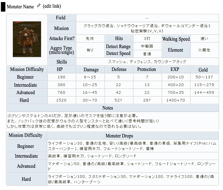
- Added an example monster, Shadow_Fighter. I decided to name the monsters Type A and Type B. --- Angevon (Talk) 20:41, 4 November 2009 (UTC)
- I see where you're going at with the fact that the mission(s) is under the "Location" heading thing, but it seems to fit there, yet it doesn't. Maybe it should be like... in its own little section, if you know what I mean. And I like the way it looks, but I worry for what it will turn out like if we convert it to the blue format... And unless they're actually called "Shadow Fighter Type A/B" ingame, I personally prefer the "(strong)" thing that is used. But I like how its looking so far ^^--♪♫♪♫тιиα♪♫♪♫ταιқ♪♫♪ 20:47, 4 November 2009 (UTC)
- I can change the locations thing. Most monsters only appear in missions, not in fields anyway. Using (Strong) could work in some cases, but some monsters have like 4 types. And no, they're not called that in-game, I just modelled it after the desingation JP was using. Whether or not this template gets changed to be more like the blue version depends on other people. I kinda feel that the current large blue monster template itself needs a redesign since so many people have complained about it, but that's for another discussion. --- Angevon (Talk) 14:36, 5 November 2009 (UTC)
- I've changed the location so that field / mission are combined without a "Location" heading. I've added a CP column (though JP doesn't have that listed so it'll be blank for every monster). To do this I combined Defense and Protection into one column. I've also added an "All" drop section since there are a lot of drops that stay the same between difficulties and repeating them 4 times is unnecessary. I've also changed the "type" to unlabeled and (Strong). I want to change the background color of the section titles but nothing looks good. Current pages are: Crag Cow (This one has a (Boss) and (Summoned) version), Shadow Fighter, and Shadow Lancer. Comments and suggestions welcome. --- Angevon (Talk) 16:22, 8 November 2009 (UTC)
- I was going to suggest sorting them by like.. Weakest, Weak, Strong, Strongest.... but that can't really be done without the cp...well...nevermind. Man.. One Shadow Missions come out, and one people start completing them, the wiki is gonna go insane... Question (it might be too early to ask it though). Is each monster (like.. each species of monster, all the strengths of them included into that "species") going to have its own page? Because if they were, then you could just list the drops at the top of the page or something, I guess. I like how it's looking so far, I don't really have anything else to say. Cept that old-school template looks.. well, old-school. But the blue templates are bigger (well, I think they're wider, and then shorter than the old-school version). Are the shadow monsters going to be 'converted' into the blue templates? Like, in the future, when they actually do exist in NA Mabi? oh. I has an idea to propose. Because they're a different type of monster (well, they're shadow thingys), maybe they deserve their own template. As in, like, a different design, and maybe a different color, like black/gray. :D..?--αмуταιқ♪♫♪ 16:49, 8 November 2009 (UTC)
- I have no idea if they will be converted to the blue template. I could maybe bother Kevin about it sometime but I don't think it's that important right now (rather get all the stats and info down in a useable way than make the template pretty atm). Anyway as it turns out, the only monster with significantly many versions is the Shadow Archer, and you know, there just happen to be enough versions to use weak/weakest/average/strong/strongest labels instead. That sounds better (and more descriptive) than using "Type A-E". Thanks for the comments :) --- Angevon (Talk) 22:37, 9 November 2009 (UTC)
- I've always liked the Japanese Wiki's table, but the one thing I noticed about it is that the information on the tables can become really cluttered. Another thing to note is that the "Misc" and "Equipment" drops are all listed in the same area. I like what Angevon's done with the Shadow Archer page template, but again, the cluttered issue comes in. If I may, I propse to use the hidden text in the templates, maybe like..
- I have no idea if they will be converted to the blue template. I could maybe bother Kevin about it sometime but I don't think it's that important right now (rather get all the stats and info down in a useable way than make the template pretty atm). Anyway as it turns out, the only monster with significantly many versions is the Shadow Archer, and you know, there just happen to be enough versions to use weak/weakest/average/strong/strongest labels instead. That sounds better (and more descriptive) than using "Type A-E". Thanks for the comments :) --- Angevon (Talk) 22:37, 9 November 2009 (UTC)
- I was going to suggest sorting them by like.. Weakest, Weak, Strong, Strongest.... but that can't really be done without the cp...well...nevermind. Man.. One Shadow Missions come out, and one people start completing them, the wiki is gonna go insane... Question (it might be too early to ask it though). Is each monster (like.. each species of monster, all the strengths of them included into that "species") going to have its own page? Because if they were, then you could just list the drops at the top of the page or something, I guess. I like how it's looking so far, I don't really have anything else to say. Cept that old-school template looks.. well, old-school. But the blue templates are bigger (well, I think they're wider, and then shorter than the old-school version). Are the shadow monsters going to be 'converted' into the blue templates? Like, in the future, when they actually do exist in NA Mabi? oh. I has an idea to propose. Because they're a different type of monster (well, they're shadow thingys), maybe they deserve their own template. As in, like, a different design, and maybe a different color, like black/gray. :D..?--αмуταιқ♪♫♪ 16:49, 8 November 2009 (UTC)
- I see where you're going at with the fact that the mission(s) is under the "Location" heading thing, but it seems to fit there, yet it doesn't. Maybe it should be like... in its own little section, if you know what I mean. And I like the way it looks, but I worry for what it will turn out like if we convert it to the blue format... And unless they're actually called "Shadow Fighter Type A/B" ingame, I personally prefer the "(strong)" thing that is used. But I like how its looking so far ^^--♪♫♪♫тιиα♪♫♪♫ταιқ♪♫♪ 20:47, 4 November 2009 (UTC)
| ◆Unknown | |||||||
| {{{Image}}} | Field / Mission | Unknown | |||||
| Offensive Stats | |||||||
| Attacks First | Unknown | Walking Speed | Unknown | Hits | ? | ||
| Aggro | Unknown | Detection Speed | Unknown | Element | ? | ||
| Detection Range | Unknown | ||||||
| Skills | Unknown | ||||||
| Difficulty-dependent Stats | |||||||
| Mission Difficulty | HP | Damage | Def. (Prot.) | EXP | Gold | Combat Power | |
| Beginner | (%) | ||||||
| Intermediate | (%) | ||||||
| Advanced | (%) | ||||||
| Hard | (%) | ||||||
| Drops | |||||||
| Mission Difficulty | Misc. | Equipment | |||||
| < All > |
|
| |||||
| Beginner |
|
| |||||
| Intermediate |
|
| |||||
| Advanced |
|
| |||||
| Hard |
|
| |||||
| Other Information | |||||||
| Notes | Unknown | ||||||
| Advice | None | ||||||
--ZephyreTALK 15:13, 10 November 2009 (UTC)
- Could I suggest using
{{{image|{{{name|none}}}.jpg}}}
- instead of just
{{{image}}}
- whichever image extension is the most popular for monster images can be used instead of "jpg". Then the image parameter can be left blank if the image name is the same as the monster name plus the ".jpg". If the image name differs from the monster name and/or the image extension is not "jpg" then the entire image name is entered into the image parameter. See Template:NPClisttable for something that uses this.
- BTW I like the table above except dont use the grey heading for the monster name. A section heading for the monster name should be used so it can be easily linked and this would make the grey heading redundant. A section heading can be incorporated into the template, unless the section levels will vary (i.e., will all section headings above each use of the monster template use the same number of "="). --ZRoc (Talk) 07:08, 12 November 2009 (UTC)
For Example:
Unknown
| File:Unknown.jpg | Field / Mission | Unknown | ||||||||||
| Offensive Stats | ||||||||||||
| Attacks First | Unknown | Walking Speed | Unknown | Hits | ? | |||||||
| Aggro | Unknown | Detection Speed | Unknown | Element | ? | |||||||
| Detection Range | Unknown | |||||||||||
| Skills | Unknown | |||||||||||
| Difficulty-dependent Stats | ||||||||||||
| Mission Difficulty | HP | Damage | Def. (Prot.) | EXP | Gold | Combat Power | ||||||
| Beginner | (%) | |||||||||||
| Intermediate | (%) | |||||||||||
| Advanced | (%) | |||||||||||
| Hard | (%) | |||||||||||
| Drops | ||||||||||||
| Mission Difficulty | Misc. | Equipment | ||||||||||
| < All > |
|
| ||||||||||
| Beginner |
|
| ||||||||||
| Intermediate |
|
| ||||||||||
| Advanced |
|
| ||||||||||
| Hard |
|
| ||||||||||
| Other Information | ||||||||||||
| Notes | Unknown | |||||||||||
| Advice | None | |||||||||||
The collapsible tables used in the Drops section have data in them and they fit the style of the table better than the hidden text boxes. Note that, there is a valign="top" above each difficulty level's drops row which makes the collapsible tables behave better when opened on each row. This can also be done for the table using the hidden text boxes. The Beginner drops row does not have the valign="top" to show what I mean about collapsible tables not behaving well (the hidden text boxes suffer from this problem as well). --ZRoc (Talk) 16:03, 12 November 2009 (UTC)
- I haven't been using the template as a style/data template so making the monster name header use a field in the template won't work. I don't think we need to force it into being a style template just for that, either. However, you're right that the grey top row is redundant (it's also ugly) so removing it is fine. I never really liked the hidden text templates for the drops in the blue template. It stops Ctrl + F from finding anything inside it without opening the box ahead of time. But it does look prettier with them. --- Angevon (Talk) 00:11, 13 November 2009 (UTC)
- Would aligning the droplist left and using <br /> tags between items work or is it still cluttered? See Crag Cow for example. Otherwise I'll go with the hidden/collapsible boxes. --- Angevon (Talk) 00:33, 13 November 2009 (UTC)
- I think the Crag Cow example is fine, I would only use the collapsible table or hidden text box version if it looks like there is going to be a lot of items dropped. However, if you use either a collapsible table or hidden text box version then I would suggest using them for all the shadow mission monsters so you have a standard style on all pages using this monster table. Aligning the droplist to the left looks better and using <br /> between items makes it easier to see the info. You could make the droplist bulleted instead of using <br /> but I dont think that looks as good. Also, I mistakenly thought this was going to become a style/data template lol. I'm happier if it isn't a style/data template XD (but someone will come along and make it into one T.T) --ZRoc (Talk) 04:20, 13 November 2009 (UTC)
- Uhmmm, have I misunderstood something again? Why cant you add
=== {{{Name|Unknown}}} ===at the top of the table's template? --ZRoc (Talk) 04:29, 13 November 2009 (UTC)- IIRC, making the header part of the template caused problems with the blue template (the section's "edit" button would link you to the template itself rather than actually editing the section), which is why NOEDITSECTION, and an "edit" option within the template itself, was added to that template. Probably would be better if we could avoid doing that.
- PS. Is everyone okay with the colors for the difficulties? Miyuna requested it. --- Angevon (Talk) 20:50, 13 November 2009 (UTC)
- Oh, your right the edit button does go to the template (I tried it on my test page). OK then we dont put the header in the template =3.
- Personally, I would prefer the plain version rather than the colored version because;
- All the info in the Shadow Monster table is of equal importance and highlighting certain sections with different colors suggests these sections have more importance.
- The table has a simple and straight forward layout therefore I see little need to add colors to seperate sections.
- The use of text instead of icons makes it easy to see what info belongs to what section and this makes the use of colors a bit of a distraction, as well as being redundant.
- The choice of using colors is subjective, what one person likes then another dislikes. Trying to stay with the base set of existing colors used by the wiki is a good way to stop disagreements about what color looks good or bad. It also looks more professional if you stay with the basic color scheme (and yes its boring but the wiki is an information source, let Mabinogi the game provide the excitement).
- Having said all that, if you still want to use colors to highlight sections then those colors look good to me XD --ZRoc (Talk) 01:03, 14 November 2009 (UTC)
- BTW would having the drop sections top aligned as in this example look any better? --ZRoc (Talk) 05:40, 14 November 2009 (UTC)
- Oh, your right the edit button does go to the template (I tried it on my test page). OK then we dont put the header in the template =3.
Would it be possible for one of you guys to code it so that the entire Drops section is under the hidden template, instead of all 10 sub-boxes? Clicking 10 times to see all possible drops is too much work, but clicking once, I'm fine with that. Grumble (Orange) has a rather long list so something like this is probably needed. --- Angevon (Talk) 16:30, 1 December 2009 (UTC)
- See User:ZRoc/Example Page for the template (ignore everything in the "noinclude" tags below the template) and go to User:ZRoc/Test_Page#Sandbox to see it being used. Is that what you wanted? Note that it works on IE8, Firefox (latest version) and Opera (latest version). --ZRoc (Talk) 18:59, 1 December 2009 (UTC)
- Also, some of the "colspan=" are wrong in the Template:Shadow Monster and on IE8 they give the right hand border (for the whole monster table) a strange look. My example template on User:ZRoc/Example Page has fixed them, I hope. --ZRoc (Talk) 19:17, 1 December 2009 (UTC)
- The weird right hand border shows if you are not using "Compatibility View" (selected in the Tools menu) in IE8 but it does other weird things if you use "Compatibility View". Another reason not to use IE lol. --ZRoc (Talk) 19:21, 1 December 2009 (UTC)
- Yes that's exactly what I wanted *hugs* It's perfect!--- Angevon (Talk) 00:25, 2 December 2009 (UTC)
- Oh, is there any order we should have when we organize the drops? Should they simply be alphabetized, or hould we have it like "potions first" "weapons before armor before headgears" or whatever, since it's not set up the same way as the normal template. --- Angevon (Talk) 00:38, 2 December 2009 (UTC)
- Your welcome XD. To keep the drop list as easy to enter as possible I would suggest using an alphabetical list only. If you do group them together then they will probably end up with group headings and that will make the lists longer. Also, unless you make a standardised list of group headings then it can get confusing as people will enter different things and in different ways (as in what happens with the normal monster tables' drops section). --ZRoc (Talk) 01:01, 2 December 2009 (UTC)
- That sounds best. Maybe later I'll go alphabetize everything; for the most part, I just want to get all the info down first. --- Angevon (Talk) 20:59, 6 December 2009 (UTC)
- Your welcome XD. To keep the drop list as easy to enter as possible I would suggest using an alphabetical list only. If you do group them together then they will probably end up with group headings and that will make the lists longer. Also, unless you make a standardised list of group headings then it can get confusing as people will enter different things and in different ways (as in what happens with the normal monster tables' drops section). --ZRoc (Talk) 01:01, 2 December 2009 (UTC)
Q62
Instead of placing a repeating event on the same page why not place it on seperate pages? For example, the Treasure Chest Event has had two so far and the first is on the page Treasure Chest Event (Jan. 2009) and the second is on Treasure Chest Event (Jan. 2009). The dates are year-month-day so they will automatically sort correctly in Category:Nexon Events. If having each repeat event listed seperately on Category:Nexon Events is not wanted, then create a sub-category for a repeat event and only have that displayed on Category:Nexon Events, with individual pages only in the sub-categories. Either way, having individual pages for each repeat event will mean they wont get longer and longer each time the event is repeated. Also, the rewards wont get mixed up by mistake as only the active event will be available in Category:Nexon Events and on the wiki's main page. --ZRoc (Talk) 05:39, 9 October 2009 (UTC)
- Sure, making separate pages is fine. ---Angevon 22:40, 9 October 2009 (UTC)
- I meant this should be applied to any event that repeats in future, the Iria exploration event which just ended had all those warnings on the page and people mistakenly adding items to the list from the earlier version of the event. Perhapes state on top of Category:Nexon Events that a repeating event should have a seperate page for each repeat (with "year-month-day to year-month-day" start and end dates). --ZRoc (Talk) 10:06, 10 October 2009 (UTC)
- Do you want to do this for every event, or just the events that repeat? We can't predict what events repeat, so I sort of feel we should have the date in the title for all event pages, but that's only because then we won't have to fix a ton of event redirects after we move the page when an event repeats. Would make the admins' job easier, heh. --- Angevon (Talk) 22:25, 16 October 2009 (UTC)
- I dont see a problem with adding the date to each event if that would help. In fact, it would also make it easier for people to see when an event was last held and the date format would be there with only the values to be changed (if copying a page's title for a repeat event). I think it may be a better idea to use it on all events, as a major part of an event is when it starts and ends. --ZRoc (Talk) 05:36, 17 October 2009 (UTC)
- I can add the dates to all the events listed in "Category:Nexon Events (Old)" if you want? As this will create redirect pages then existing links should still work but I can find (by using "What links here") and change those links to the new name if you wish. Also, on the Miscellaneous Events and Event Quests pages do you want me to seperate the events and place them on their own pages. At least two events have been repeated that are on "Miscellaneous Events (Old)" and a number have seasonal/holiday names which means they may be repeated. Of course, Nexon can choose to repeat any event they wish to. --ZRoc (Talk) 04:07, 18 October 2009 (UTC)
- I dont see a problem with adding the date to each event if that would help. In fact, it would also make it easier for people to see when an event was last held and the date format would be there with only the values to be changed (if copying a page's title for a repeat event). I think it may be a better idea to use it on all events, as a major part of an event is when it starts and ends. --ZRoc (Talk) 05:36, 17 October 2009 (UTC)
- Do you want to do this for every event, or just the events that repeat? We can't predict what events repeat, so I sort of feel we should have the date in the title for all event pages, but that's only because then we won't have to fix a ton of event redirects after we move the page when an event repeats. Would make the admins' job easier, heh. --- Angevon (Talk) 22:25, 16 October 2009 (UTC)
- I meant this should be applied to any event that repeats in future, the Iria exploration event which just ended had all those warnings on the page and people mistakenly adding items to the list from the earlier version of the event. Perhapes state on top of Category:Nexon Events that a repeating event should have a seperate page for each repeat (with "year-month-day to year-month-day" start and end dates). --ZRoc (Talk) 10:06, 10 October 2009 (UTC)
Q63 weaponbox
What do you guys think of this template suggestion for adding splash info to the weapon tables?
- If you want to change the template then remove the inventory image and inventory size. Put those in an image gallery (with the equipped and sheathed weapon images) in a "Description" section, as is done for equipment items. That will give you more room to present the weapon info. Also, I would center "Radius", "Angle" and "Damage" (both the titles and the data) to keep it consistent with the rest of the table. Note that a lot of pages use the actual template, so if you change it then make as few edits as possible (otherwise Irjustman is not gonna be happy if the fan-out causes problems). Other than that, it looks good. --ZRoc (Talk) 09:45, 10 October 2009 (UTC)
- Keep in mind that soon enough there will be more repair % options (like 96% and 97%) so the repair box will need to be adjusted so that it can be expanded. ---Angevon 16:34, 10 October 2009 (UTC)
- In that case you might want to add all the possible repair percentages, as many right hand equipped items (tools, weapons, wands, instruments, etc) are repaired by different types of NPCs. Non-magical weapons and many tools are repaired by Blacksmith/Weapon Shop NPCs but instruments (plus a few tools) and wands are repaired by General Store NPCs and Magic/Healer NPCs, respectively. For repair percentages that dont apply perhapes have them as "n/a". --ZRoc (Talk) 21:14, 10 October 2009 (UTC)
- The repair box is already causing a problem with the box size of the other boxes on the wand template. If there's going to be even more inconsistency with the sise of that box, maybe it would be best to have it as a separate table, and use the main one only for things directly related to using it in combat?
- After looking at ZRoc's templates, i realized i completely forgot about stam use...
- On all the pages that have the inventory picture in a picture table, the inventory one looks out of place, partially because it's purely 2d. I don't see what would have been wrong with leaving the pictures in the corner in the first place. When they're in a table like that, the page becomes more cluttered, yet more empty at the same time... For clothing there is some reason for doing that, but for weapons I don't think that their looks are important enough to have their own section on each page.--Sozen Cratos Focker 06:26, 11 October 2009 (UTC)
- See the discussion in Question_and_Answer/Archive1#Q16 as to why it was agreed to use the image gallery (picture table). Note that leaving the inventory image with the weaponbox template has its own problems. The inventory image cell (not the image itself) can get stretched as shown here, the inventory size cell can get stretched as shown here or even worse, both could occur. As more major updates are added to the game then more NPCs selling an item and more ways to obtain an item will be added. The inventory image and inventory size are going to look a lot weirder for some items when they are in the weaponbox template rather than in an image gallery. Although there are usually only sheathed and equipped images for melee weapons, however instruments have sheathed, equipped and playing images. Unlike what its name suggests, the weaponbox template is used for all right-hand equipped items and funnily enough a significant number of them are not meant to be used as melee weapons. They may also require different or more images to correctly display them, for which a hard code (not a template) image gallery would work just fine. --ZRoc (Talk) 07:37, 11 October 2009 (UTC)
- The weapon box does look kind of naked without the inventory icon, though... Anyway, as mentioned, the "Dropped By" section gets so huge on some weapons that I'm not sure it should even go in the box. Also, do you think the "Sales At" section should be deleted if the weapon is not sold in stores, or just noted "Not sold by NPCs" or whatever? (like on potion pages --- this can be coded into the template if it is decided to keep template mode). Or we can removes "Sales At" entirely and just make a "Store Locations" section on the page like all the other equipment pages. Uh, I'm starting to overlap my Q65. --- Angevon (Talk) 15:33, 12 October 2009 (UTC)
- The image is no more relevant in the Base Stats section than in any other section. Also, using just the inventory image makes no sense as an equipped image (with the player in an aggro stance) would provide more relevant info, e.g., actual size of weapon when equipped, one handed or two handed grip, etc. I replied to the rest of Angevons's above message in Q65. --ZRoc (Talk) 01:37, 13 October 2009 (UTC)
- The weapon box does look kind of naked without the inventory icon, though... Anyway, as mentioned, the "Dropped By" section gets so huge on some weapons that I'm not sure it should even go in the box. Also, do you think the "Sales At" section should be deleted if the weapon is not sold in stores, or just noted "Not sold by NPCs" or whatever? (like on potion pages --- this can be coded into the template if it is decided to keep template mode). Or we can removes "Sales At" entirely and just make a "Store Locations" section on the page like all the other equipment pages. Uh, I'm starting to overlap my Q65. --- Angevon (Talk) 15:33, 12 October 2009 (UTC)
- See the discussion in Question_and_Answer/Archive1#Q16 as to why it was agreed to use the image gallery (picture table). Note that leaving the inventory image with the weaponbox template has its own problems. The inventory image cell (not the image itself) can get stretched as shown here, the inventory size cell can get stretched as shown here or even worse, both could occur. As more major updates are added to the game then more NPCs selling an item and more ways to obtain an item will be added. The inventory image and inventory size are going to look a lot weirder for some items when they are in the weaponbox template rather than in an image gallery. Although there are usually only sheathed and equipped images for melee weapons, however instruments have sheathed, equipped and playing images. Unlike what its name suggests, the weaponbox template is used for all right-hand equipped items and funnily enough a significant number of them are not meant to be used as melee weapons. They may also require different or more images to correctly display them, for which a hard code (not a template) image gallery would work just fine. --ZRoc (Talk) 07:37, 11 October 2009 (UTC)
- How's this? I removed what you guys wanted removed and rearranged the table a bit to make everything fit beater after the removals, added stamina, moved repair to the side so that it can expand without messing things up much, added all repair success rates i know about so the table can be used for any weapon and we don't need separate ones for wands/instruments/etc and added if functions so a repair price is only displayed if it exists.
- Are there going to be any repair success rates besides 90, 92, 93, 95, 97 & 98?
- And is there anything else that might be worth putting in the table that I'm forgetting/I don't know about?--Sozen Cratos Focker 04:32, 14 October 2009 (UTC)
- I really think you should just remove the repair section because if Nexon adds more repair success percentages for a single item then its still going to stretch your table. Also, if you remove the repair section I dont think you should make it into a template. The weaponbox template is already there but is restricted to weapons. A repair table template would end up on almost every weapon and equipment item's page. In that case, probably just doing one edit to the template is going to cause a real problem on the server. Your going to end up restricting access to that template, like Template:StyleMonster is, which just doesn't make sense for something that would be so simple to copy and paste as hard code, then change the percentages as necessary. --ZRoc (Talk) 10:43, 14 October 2009 (UTC)
- Woops forgot to add, it should be "Stamina Used per swing", just using "Stamina" (even with a link) doesn't make much sense and can easily confuse people. Also, the "Repair" section in your template should remain "Repair Fee per point", which should be added to the Repair section on equipment pages as well (plus weapon pages if you decide to remove the "Repair" section from the weaponbox template). Remember the wiki is used by inexperienced and experienced players, we need to be as clear as possible about what we mean (and some, like me, have very short attention spans). The monster table template is a good example of concise info but is very confusing, especially for those new users (and some not so new users) trying to find a quick answer. --ZRoc (Talk) 11:00, 14 October 2009 (UTC)
- I agree that "stamina" is a bit too vague, but "Stamina Use For Each Swing Of Normal Attack" is a bit too long for a table, Same for the repair info. Perhaps I should just abbreviate everything in the table and link part of it to a page explaining each part of the table.--Sozen Cratos Focker 05:55, 15 October 2009 (UTC)
- "Stamina Used per swing" and "Repair Fee per point" convey the basic idea and I did say they should be as clear as possible lol (using those and linking to a page that explains it should be enough). Abbreviations might work but should be left for something like list tables which may really need to keep their column headings narrower than the full name of a column title. Is the weaponbox table so wide that it cant use "Stamina Used per swing" and "Repair Fee per point"? Also instead of having Splash by itself, why not just use "Splash Radius", "Splash Angle" and "Splash Damage", remove "Resell" (put it in the Description section as it is for Equipment items) and remove "Price" (making it the "Store Locations" section as suggested in Q65). Then you can have "Splash Radius", "Splash Angle", "Splash Damage" and "Stamina Used per swing" as one column in the weaponbox template. --ZRoc (Talk) 06:31, 15 October 2009 (UTC)
- Also, I think you should leave all the cell's in the weapon box table centered rather than having titles aligned to the right and data aligned to the left. Its pretty obvious, without the right/left alignments, which title cell is referring to its related data cell and centered looks better XD --ZRoc (Talk) 08:21, 15 October 2009 (UTC)
- I agree that "stamina" is a bit too vague, but "Stamina Use For Each Swing Of Normal Attack" is a bit too long for a table, Same for the repair info. Perhaps I should just abbreviate everything in the table and link part of it to a page explaining each part of the table.--Sozen Cratos Focker 05:55, 15 October 2009 (UTC)
- In that case you might want to add all the possible repair percentages, as many right hand equipped items (tools, weapons, wands, instruments, etc) are repaired by different types of NPCs. Non-magical weapons and many tools are repaired by Blacksmith/Weapon Shop NPCs but instruments (plus a few tools) and wands are repaired by General Store NPCs and Magic/Healer NPCs, respectively. For repair percentages that dont apply perhapes have them as "n/a". --ZRoc (Talk) 21:14, 10 October 2009 (UTC)
- Keep in mind that soon enough there will be more repair % options (like 96% and 97%) so the repair box will need to be adjusted so that it can be expanded. ---Angevon 16:34, 10 October 2009 (UTC)
- I am thinking about removing price and resell from the table, but i'm not going add repetitive bulk to every cell in the column just to prevent a long line from looking out of place there. It's not that i think doing so would make it too wide, just that doing so would defeat the purpose of using a table. I'm trying to avoid all of the mistakes of the new monster template, including all the wasted space/unnecessary padding. I'l just have to think of a way to make the link to the explanation page obvious enough without it being distracting.--Sozen Cratos Focker 08:39, 15 October 2009 (UTC)
- I think you're right about the columns.--Sozen Cratos Focker 08:39, 15 October 2009 (UTC)
Ok I think I've tried hard enough, if you're not gonna listen I'll just go sit in the corner and fume... finished fuming (very, very low attention span). Gonna play mabi's new update and kill a few monsters, that should make me feel better XD --ZRoc (Talk) 11:55, 15 October 2009 (UTC)
Q64 books
On the Template:In-game book this has been added:
| 1 x 2 |
It places the image of the same book on every in-game book page and surprisingly (sarcasm intended) the inventory size is always 1x2. In my opinion, the in-game book pages are made to appear, as much as possible, as if the book itself is being read (with any extra info placed in the information box on the right-hand side). This addition really looks out of place and does not provide any needed info. Even new players quickly figure out that in-game books have the same book inventory icon, that they are all the same size and can be any color. May I PLEASE remove this rather useless code from the template. --ZRoc (Talk) 09:24, 11 October 2009 (UTC)
- I agree that we don't need this on pages. Originally, it wasn't necessary, and it still isn't. --Aramet (Talk) 16:59, 11 October 2009 (UTC)
- I'm deleting the code from the template, if there is a reason to put it back then please post that reason here first, so we can discuss it before any further change to the template is made. My apology if the change to the template causes any fan out problems. --ZRoc (Talk) 06:20, 12 October 2009 (UTC)
Q65 weapons page
I know we're still trying to find a format for weapon pages. What order of the sections do you prefer for section appearance of weapon pages so that we can come to a concensus? Here is my suggestion:
- Description
- Limitations
- Base Stats
- Item Grades
- Repair Costs (if we decide to make a separate section for it).
- Store Locations (if applicable, if not, delete section)
- Drop Locations (monsters only. Delete section if not dropped by monsters)
- Fishing Locations (if applicable, if not delete section)
- Obtained From (everything not monsters or fishing)
- Smithing/Handicraft/Carpentry Details (if applicable, if not, delete section)
- Upgrades (if applicable, if not, delete section and note in Limitations)
- Upgrade Sequences
- Spirit Weapon Info (if applicable, if not, delete section and note in Limitations)
- References (probably every page'll get a ref. to JP Wiki lol)
I think we can agree on the upgrades and spirit weapon info being at the bottom. But the first three sections, I'm not sure. Limitations above Base Stats, as we currently have it, makes it mirror the clothing/armor/etc. pages, but in the case of weapons, I feel the Base Stats is a little more important so they should go higher up in the heirarchy. But, of course, it's up to you all. I just don't like having to scroll down to find the Base Stats box heh. --- Angevon (Talk) 15:25, 12 October 2009 (UTC)
- As the NPCs selling an item and the ways to obtain an item keep increasing then I strongly recommend that these be seperated from the Base Stats table and given their own sections. Also, when an item is made by a skill then it usually ends up being repeated in either the "Dropped By" or "Sales At" section of the Base Stats table and in a Skill Requirements section (note that some weapons are made by other methods than Blacksmithing, e.g., Ghost Swords use Handicraft). Similarly, items obtained from events, collection books or some other method, not involving a monster drop or sold by an NPC, may need more than a few short words to describe how to obtain them. Added to that, the Base Stats table does not clearly indicate where to put these different methods of obtaining an item ("Dropped By" or "Sales At").
- I think Limitations should probably be above Base Stats, because it normally only contains a few lines and therefore wont push the Base Stats section off the browser window on small monitors. In its present form the Base Stat table can get quite large and can end up pushing the Limitations section off the browser window. I believe the Limitation and Base Stat sections should be immediately visible when someone opens a weapons page, as both are fairly important. --ZRoc (Talk) 01:12, 13 October 2009 (UTC)
- Okay. Limitations before Base Stats. I added some sections for drop locations and fishing to the list. In the end I guess the best way is to just follow the other equipment pages for these sections. --- Angevon (Talk) 23:27, 13 October 2009 (UTC)
- You may want to make the Upgrade Sequences section as a hidden text box (as is done on equipment pages that have upgrades), as the number of possible sequences are getting a bit long on some weapon pages. I'm not sure if all of them are really necessary but I'm not a good judge of what is worthy, as I haven't done many upgrades. --ZRoc (Talk) 01:30, 14 October 2009 (UTC)
- I think that the limitations section should be removed altogether on most pages. It wastes space listing things that are the same for every weapon of that type. There should just be a note about those things on the page for each type of weapon(2h swords, 1h swords, etc.) and for weapons that actually do have unique limitations, It might be a good idea to have the limitations section as a subsection of the description section(i just don't think it's important enough for the word "limitations" to be that big AND in bright red...).
- You may want to make the Upgrade Sequences section as a hidden text box (as is done on equipment pages that have upgrades), as the number of possible sequences are getting a bit long on some weapon pages. I'm not sure if all of them are really necessary but I'm not a good judge of what is worthy, as I haven't done many upgrades. --ZRoc (Talk) 01:30, 14 October 2009 (UTC)
- Okay. Limitations before Base Stats. I added some sections for drop locations and fishing to the list. In the end I guess the best way is to just follow the other equipment pages for these sections. --- Angevon (Talk) 23:27, 13 October 2009 (UTC)
- I think Limitations should probably be above Base Stats, because it normally only contains a few lines and therefore wont push the Base Stats section off the browser window on small monitors. In its present form the Base Stat table can get quite large and can end up pushing the Limitations section off the browser window. I believe the Limitation and Base Stat sections should be immediately visible when someone opens a weapons page, as both are fairly important. --ZRoc (Talk) 01:12, 13 October 2009 (UTC)
My alternative suggested format(using extra indentation to represent subsections(triple "=" instead of double)/parts of a section):
- Description
- Limitations(only when needed)
- Stats
- Base Stats table
- Item Grades
- [in a hidden box]Upgrades (if applicable, if not, delete section and note in Limitations)
- [in a hidden box]Upgrade Sequences
- [in a hidden box]Spirit Weapon Info (if applicable, if not, delete section and note in Limitations)
- Repair Costs (if we decide to make a separate section for it).
- How to Obtain
- Store Locations (if applicable, if not, delete section)
- Drop Locations (monsters only. Delete section if not dropped by monsters)
- Fishing Locations (if applicable, if not delete section)
- Obtained From (everything not monsters or fishing)
- Crafting(Smithing/Handicraft/Carpentry) Details (if applicable, if not, delete section)
- Other(if applicable, in case there's something we missed)
- References (probably every page'll get a ref. to JP Wiki lol)
--Sozen Cratos Focker 03:35, 14 October 2009 (UTC)
- Listing general limitations of items on a category page is a good idea but they really should be listed on each item's page as well. Some users may use a category to find a particular item but others just search and bypass the categories. Having information pertinent to an item only placed on a category page means searching for it and also knowing where to look. So, either you have the limitations on an item's page or a specific message on each item page stating where to look for the limitations. Also, if the item has limitations that are not available on all the items in that category then you will have some limitations listed on the category's page, a message on the item's page stating where to find those limitations and a limitations section on the item's page listing it's unique limitations. That's just a plain mess. However, having the Limitations section as a sub-section of Description is a nice idea. As for the red font, Aramet thought of it (I think) and I beleive its a good idea.
- The How to Obtain and Stats sections are a good idea. The Obtained From section was meant for everything else that doesn't have its own section. So, in your How to Obtain section perhapes replace Obtained From with Other (or Other Methods) as that is a more accurate name. You may want to add Jewel Upgrades to your Stats section. --ZRoc (Talk) 10:22, 14 October 2009 (UTC)
- I strongly oppose listing anything that general at the top of every page, just the thought of it disgusts me...(I guess that might just be my OCD talking) Even beginners shouldn't have reason to see it that much, one look is more than enough to memorize it. I still say a one word link to the category page is enough for the standard limitations.
- As for the "other" section of "how to obtain", i just didn't read all of them =P I just copied, pasted, and rearranged your layout idea.--Sozen Cratos Focker 06:32, 15 October 2009 (UTC)
- The How to Obtain and Stats sections are a good idea. The Obtained From section was meant for everything else that doesn't have its own section. So, in your How to Obtain section perhapes replace Obtained From with Other (or Other Methods) as that is a more accurate name. You may want to add Jewel Upgrades to your Stats section. --ZRoc (Talk) 10:22, 14 October 2009 (UTC)
- Description
- Weapon type(one word link at the bottom of the description section, not it's own subsection)
- Other info(when applicable) (Unique Limitations, and/or other unique properties such as the Brionac's effect on the spark skill.)(
- Stats
--Sozen Cratos Focker 08:50, 15 October 2009 (UTC)
- Searching for an item to find info on it and then having to remember to go to its category page is a pain in the butt >=3. I know I'm lazy but if most internet users weren't then there wouldn't be much use for the web (blatant exaggeration but still somewhat true) XD --ZRoc (Talk) 09:55, 15 October 2009 (UTC)
- I'm sure you don't need to go to the category page, because you, along with just about anyone who's played this game for more than 2 hours, already know the standard ones, and the people who hear about the wiki before finding these out probably won't need to look it up more than once.--Sozen Cratos Focker 20:02, 15 October 2009 (UTC)
- We obviously dont agree on what should be done with the Limitations section, lets hope some other users will add their opinions. I've given my reasons, as have you, so whatever is agreed to then I'll just have to accept it =3 --ZRoc (Talk) 23:49, 15 October 2009 (UTC)
- I'm surprised this has gone on so long without anyone else's input, I've been waiting to see what others think this whole time...--Sozen Cratos Focker 00:42, 16 October 2009 (UTC)
- We obviously dont agree on what should be done with the Limitations section, lets hope some other users will add their opinions. I've given my reasons, as have you, so whatever is agreed to then I'll just have to accept it =3 --ZRoc (Talk) 23:49, 15 October 2009 (UTC)
- I'm sure you don't need to go to the category page, because you, along with just about anyone who's played this game for more than 2 hours, already know the standard ones, and the people who hear about the wiki before finding these out probably won't need to look it up more than once.--Sozen Cratos Focker 20:02, 15 October 2009 (UTC)
- Searching for an item to find info on it and then having to remember to go to its category page is a pain in the butt >=3. I know I'm lazy but if most internet users weren't then there wouldn't be much use for the web (blatant exaggeration but still somewhat true) XD --ZRoc (Talk) 09:55, 15 October 2009 (UTC)
How do you like User:Angevon/Dagger? Changes made: "Advice" from upgrade sequences moved to "Description". "Limitations" has been kept until other users give us their opinions on it. I made a separate "Method to Obtain" section for dungeon rewards. Instead of using "Other" for Gachapon/Exploration/PTJ, I called it "Miscellaneous" because some items are Gacha only and having "Other" as the only method to obtain looks funny. Upgrade-related things are grouped together, and so are spirit weapon things. Upgrade Sequences and Spirit Weapon Stats table are hidden. Problem: the page is still very long. I tried using the hidden text templates on the "General Upgrades" but it wouldn't accept the closing tag, so I was forced to keep it unhidden. Can anyone think of a better way to do "Weapon Grades"? That table is also quite long and, in my opinion, not exactly useful. --- Angevon (Talk) 20:17, 18 October 2009 (UTC)
- Looks good but instead of having the Store, Monster Drop and Dungeons tables with the same column widths, I would let them be different so that (as much as it can reasonably be done) the info is on as few lines as possible (the enchant column in the dungeon table really should be wider). This means a table would use up less height. For the description section I would remove Advice and simply have;
- Even though it's light and easy to use, blah, blah, blah want as their first weapon.
- While it may seem lackluster at first, the dagger has both high balance and a high critical rate, making it arguably the best weapon to use with Final Hit due to its fast attack speed. The main downside is its very low durability. As a result, player-made or high-durability daggers are recommended in order to get the most out of upgrades.
- Resell Value: 346g.
- For a quick comparison of swords see Swords List and for individual articles see Category:Swords.
- With the resell value statement under the advice statement (the advice seems more important to me). --ZRoc (Talk) 21:30, 18 October 2009 (UTC)
- For the Weapon Grades table would this example help? --ZRoc (Talk) 22:24, 18 October 2009 (UTC)
- I love that collapsible table you made and used it for upgrades and spirit weapons. I took out the headers for the subsections of upgrades and spirit weapons so now the TOC is shorter too. --- Angevon (Talk) 22:54, 18 October 2009 (UTC)
- Ummm slight problem lol. Making the top title (what shows when the table is hidden) a fixed width has compressed the columns. The top title must either have no width or it must at least be as long as the total width of all the columns in the table added together. --ZRoc (Talk) 23:12, 18 October 2009 (UTC)
- In fact, it needs to be slightly more than the sum of all the column widths as it needs to also include the borders (the borders may only be 1px wide but for the Weapon Grades table thats another 7px). --ZRoc (Talk) 23:19, 18 October 2009 (UTC)
- This is a reminder on why we must check how it looks on all browsers. It doesn't squish the tables on mine, but I see that it does in Firefox. They looked so good at the same width when collapsed, too :< oh well. I've removed the width parameter. Thanks for telling me! --- Angevon (Talk) 23:23, 18 October 2009 (UTC)
- Oh, I didn't know IE did that (rats, IE actually did something better than Firefox T.T), your right checking on other browsers is a good idea. --ZRoc (Talk) 23:38, 18 October 2009 (UTC)
- The ToC and picture table take up too much height, and they push everything down so much i can't even see anything that i go to a weapon page for without scrolling. Either the ToC, the picture table, or both should be moved to the completely wasted top right corner, so that we can fit more on one screen.--Sozen Cratos Focker 02:02, 19 October 2009 (UTC)
- Oh, I didn't know IE did that (rats, IE actually did something better than Firefox T.T), your right checking on other browsers is a good idea. --ZRoc (Talk) 23:38, 18 October 2009 (UTC)
- This is a reminder on why we must check how it looks on all browsers. It doesn't squish the tables on mine, but I see that it does in Firefox. They looked so good at the same width when collapsed, too :< oh well. I've removed the width parameter. Thanks for telling me! --- Angevon (Talk) 23:23, 18 October 2009 (UTC)
- I love that collapsible table you made and used it for upgrades and spirit weapons. I took out the headers for the subsections of upgrades and spirit weapons so now the TOC is shorter too. --- Angevon (Talk) 22:54, 18 October 2009 (UTC)
Would this example be of any use? I'm not sure its a good idea but it sort of fixes Sozen Cratos Focker's problem. --ZRoc (Talk) 02:36, 19 October 2009 (UTC)
- I changed it slightly, I've added a width for the ToC column so that it can be adjusted. --ZRoc (Talk) 02:45, 19 October 2009 (UTC)
- Angevon please have a look at this new example. I think its a bit tidier than what you have now. Note that the Description section is editable and only effects what is under it (it will not include the table of contents code). Having the images above the text will make it less squashed on smaller monitors. The width of the description section can be adjusted (it is set at 80% width of the window in this example). --ZRoc (Talk) 03:57, 19 October 2009 (UTC)
- Also, the size of the images can be reduced as well to save some more height, remember its an image gallery where you can click on an image to see the full size version. --ZRoc (Talk) 04:05, 19 October 2009 (UTC)
- is there any way to have the text wrap around the picture table or the toc?--Sozen Cratos Focker 03:19, 21 October 2009 (UTC)
- I'm not sure the above was a good idea in the first place but to a degree it does what you asked. Note that having the text wrap around the ToC or image gallery looks very squashed and weird on a smaller window (and therefore smaller monitors). Also the image height has been reduced to save a bit more space. I suggest you live with some white space on the screen =P --ZRoc (Talk) 17:10, 21 October 2009 (UTC)
- is there any way to have the text wrap around the picture table or the toc?--Sozen Cratos Focker 03:19, 21 October 2009 (UTC)
Have a look at this example it places the ToC above a vertical image gallery on the right hand side of the page. Because the ToC and image gallery are in a table the edit buttons for the sections on a page remain lined up with the section headers. The white space on the right hand side is now being used and you can see more of the page's text but not necessarily all the images at once (hopefully, this wont bother anyone lol). This works for Firefox V3.5 and IE V8. --ZRoc (Talk) 11:43, 22 October 2009 (UTC)
- You're definitely going to need to get a lot of opinions before that one's approved, especially since Hengsheng got beat up a few months ago for putting TOC on the right. To me it's not visually pleasing (I'd rather have the pictures side-by-side horizontally), but if everyone else is okay with it, I'll go with it. --- Angevon (Talk) 14:05, 22 October 2009 (UTC)
- Oh, I didn't realise that, please don't beat me up T.T Back to the drawing board *sigh* --ZRoc (Talk) 18:17, 22 October 2009 (UTC)
- I think I was trying too hard to please Sozen Cratos Focker. I would actually really prefer the images horizontal, I still think having the ToC in the table is not a good idea and I dont have a problem with the white space on the right hand side. I really think the weapon pages should be presented as the equipment pages are, i.e., ToC, Description (with horizontal image gallery), Limitations and Base Stats one above the other and in that order. I'm not going back to the drawing board =P. Also if the Base Stats and the Weapon/Item Grades tables are in the same section then that section should be called Weapon Stats or Item Stats but not Base Stats as the Weapon/Item Grades are not base stats. By the way, to be more consistent and stop possible confusion, should we use Item Grades on all equipment and weapon pages instead of Weapon Grades, Armor Grades, Shoe Grades, etc? --ZRoc (Talk) 19:04, 24 October 2009 (UTC)
- I guess technically we should have all the equipment pages the same format, but in the case of weapons the stats really are more important than the pictures so they need to be more visible (this goes back to my initial question of section order). I liked the one with the Description nested to the right of the TOC (I still have it like that on my Dagger page). The other option we have is to move the pictures to a completely new section of their own (I tried that User:Angevon/Dagger2 but I don't really like and it really isn't that different from the other example). And yes, we can stick to Item Grades for that section; it makes copypasta easier.--- Angevon (Talk) 19:19, 24 October 2009 (UTC)
- OK in that case I like the first example, User:Angevon/Dagger, better. However I would include Description as a section heading above the image gallery as this will allow you to edit just that section instead of the whole page, as shown in this example. The only issue I have is that the ToC is in a table and Wikipedia doesn't do it so I'm a bit wary of changing something as basic as that. If no-one sees a problem with it then I'm probably worrying about nothing. --ZRoc (Talk) 21:12, 24 October 2009 (UTC)
- I guess technically we should have all the equipment pages the same format, but in the case of weapons the stats really are more important than the pictures so they need to be more visible (this goes back to my initial question of section order). I liked the one with the Description nested to the right of the TOC (I still have it like that on my Dagger page). The other option we have is to move the pictures to a completely new section of their own (I tried that User:Angevon/Dagger2 but I don't really like and it really isn't that different from the other example). And yes, we can stick to Item Grades for that section; it makes copypasta easier.--- Angevon (Talk) 19:19, 24 October 2009 (UTC)
- I think I was trying too hard to please Sozen Cratos Focker. I would actually really prefer the images horizontal, I still think having the ToC in the table is not a good idea and I dont have a problem with the white space on the right hand side. I really think the weapon pages should be presented as the equipment pages are, i.e., ToC, Description (with horizontal image gallery), Limitations and Base Stats one above the other and in that order. I'm not going back to the drawing board =P. Also if the Base Stats and the Weapon/Item Grades tables are in the same section then that section should be called Weapon Stats or Item Stats but not Base Stats as the Weapon/Item Grades are not base stats. By the way, to be more consistent and stop possible confusion, should we use Item Grades on all equipment and weapon pages instead of Weapon Grades, Armor Grades, Shoe Grades, etc? --ZRoc (Talk) 19:04, 24 October 2009 (UTC)
- Oh, I didn't realise that, please don't beat me up T.T Back to the drawing board *sigh* --ZRoc (Talk) 18:17, 22 October 2009 (UTC)
So, now I've made three more examples.
- User:Angevon/Dagger --- Description section w/ pictures to the right of the TOC. Base Stats section below.
- User:Angevon/Dagger2 --- Base Stats box above Description info and to the right of TOC. Pictures moved to "Appearance" section.
- User:Angevon/Dagger3 --- put the Base Stats box above the pictures in the Description section, all to the right of TOC. This version was made so that more things can be seen immediately when the page is opened.
The TOC itself does not look right on the right so I'm keeping it on the left.
Opinions wanted. They will be used to synthesize yet another example. --- Angevon (Talk) 02:58, 20 November 2009 (UTC)
- I think it looks better on the right, because most of the other info will already be justified to the left, so then there's "room" for the TOC on the right. I would suggest putting it in the center, but that'd look odd.
- At Angevon: was that a pun..? *horrible when it comes to getting jokes, which is why I tend to hate it when people play jokes on me ;.;*--αмуταιқ♪♫♪ 03:10, 20 November 2009 (UTC)
With TOC on the right.
- User:Angevon/Dagger_TOC_Right
- User:Angevon/Dagger2_TOC_Right
- User:Angevon/Dagger3_TOC_Right
--- Angevon (Talk) 15:09, 20 November 2009 (UTC)
- I think the ToC should remain on the left. It's the default position and changing it for all equipment (including weapon) item pages will make it inconsistent with other pages on the wiki. The problem of white space to the right of the ToC (or to the left, if you change its position to the right side) is a problem on every single page that uses a ToC, not just equipment (including weapon) item pages. If this is really of so much concern then you may as well make this a change for all the wiki pages. On the other hand you could make long ToCs part of a collapsed table as in this example. --ZRoc (Talk) 08:23, 25 November 2009 (UTC)
- Actually make all the ToCs into collapsible tables as that would be more consistent, if you want to use this idea. Also, κєνıи has suggested there is a way to change the wiki software (something only IJ can do) that may provide collapsed (hidden) ToCs by default. That may be a better solution. --ZRoc (Talk) 18:02, 25 November 2009 (UTC)
- Also, for the titles of the collapsible (hidden) tables place a hard space (i.e.,
) in front of the title to move it away from the border, it looks better (in my opinion lol). - As the Weapon Grades hidden table appears now;
|
- With
in front of Weapon Grades
|
- --ZRoc (Talk) 11:02, 25 November 2009 (UTC)
- Wow, I never thought of doing that. What a simple solution. --- Angevon (Talk) 23:59, 25 November 2009 (UTC)
- I don't think we should force all ToCs across the wiki to be collapsed. It takes away the point of even having them. --- Angevon (Talk) 00:03, 26 November 2009 (UTC)
- I kinda like it on the right (the TOC, I mean), but the fact that it kinda shifts the description and other stuff that might be there kinda throws off the..."likeness" I have for it. The fact that it's kinda there, in the area that has nothing there (meaning, like DIRECTLY right of the picture) is kinda nice. c: (all in reference to the first link you stated) *obviously different*--Dяαмαятιѕтιс 's ταιқ 00:17, 26 November 2009 (UTC)
- OK then at least consider using the collapsed ToC for the weapon and other equipment pages. Also, consider using it for any page that has a really long ToC such as the NPCs page. --ZRoc (Talk) 06:03, 27 November 2009 (UTC)
- Also, the font color and background color of the collapsed ToC (what shows when the ToC is hidden) should probably be changed to match the actual ToC table but I'm not bothering unless you want to use this idea lol --ZRoc (Talk) 06:06, 27 November 2009 (UTC)
- I kinda like it on the right (the TOC, I mean), but the fact that it kinda shifts the description and other stuff that might be there kinda throws off the..."likeness" I have for it. The fact that it's kinda there, in the area that has nothing there (meaning, like DIRECTLY right of the picture) is kinda nice. c: (all in reference to the first link you stated) *obviously different*--Dяαмαятιѕтιс 's ταιқ 00:17, 26 November 2009 (UTC)
Q66 images
This may just be a dumb question but why are the images in Template:NPClisttable and Template:StyleMonster restricted to the jpg image extension? I realise that this allows you to restrict the image name to the NPC's or Monster's name but what's the point? I would have thought it more important to have an image available no matter what the name or extension, within the wiki's image policy of course. Especially when images are obtained from other servers and Nexon doesn't use the same name for the NPC or Monster when introducing them to the NA server. For example, Arneng appears to have been added to the NPC list page before the Dragon update but the NPC is actually called Arenen on the NA server and changing his name removes his image from the NPC list page. Can a correctly named (file?) page be redirected to the file page of an image using the wrong name or extension? Even if that's possible, it's just a little complicated isn't it? Wouldn't it have been a lot simpler to have added an Image parameter (as Template:Infobox does, which is used for an NPC's info box on their individual page) that just accepted whatever image name is entered (including whatever extension is used) instead of only using the precise name of the NPC or monster followed by the jpg extension. Ensuring the image name matches the target's name is useful but being able to quickly and easily add an image is far more helpful. Besides, incorrectly named images can always be re-uploaded with the desired name. --ZRoc (Talk) 09:41, 15 October 2009 (UTC)
- If you could tell me where and what to put for the parameter, I could put it in for StyleMonster. Template:NPClisttable isn't protected so feel free to add it yourself. --- Angevon (Talk) 14:17, 15 October 2009 (UTC)
- About a third of the way down on Template:StyleMonster this
- About a third of the way down on Template:StyleMonster this
<!-- IMAGE -->
   <td width="180" height="240" bgcolor="#ffffff" rowspan="3"><center>[[File:{{{Name|None}}}.jpg|180x240px]]</center></td>
- can be changed to
<!-- IMAGE -->
   <td width="180" height="240" bgcolor="#ffffff" rowspan="3"><center>[[File:{{{Image|None}}}|180x240px]]</center></td>
- but you also need to add Image as a parameter to Template:StyleMonster/doc and update the Usage table.
- Nobodies gonna be upset if I change Template:NPClisttable and if you change Template:StyleMonster? I thought I was gonna be told to shut-up and go away XD --ZRoc (Talk) 23:41, 15 October 2009 (UTC)
- If you do change Template:StyleMonster then let me know and I'll add the Image parameter to the individual monster templates using it (I think I just volunteered for a lot of work XD). --ZRoc (Talk) 02:45, 16 October 2009 (UTC)
- I'm a little leary of doing this. Until the Image parameter is put in, none of the pictures will show up, right? Also somewhat related, a while back Random asked us to do something (last section on the talk page there) with the file extension parameter --- would this accomplish the same thing? Only asking because you seem to be learning a lot about coding now hehe. You can probably figure out what he wanted with that. Of course I could just ask him but I don't want to be obligated to do anything about it. Annnnd also, maybe try to ask Aramet what she thinks because she's the main person dealing with the monster template and doing image redirects for it. I don't want to end up making more work for her. --- Angevon (Talk) 22:36, 16 October 2009 (UTC)
- Same thing, you are adding the parameter "ext" to Template:StyleMonster, which means you also need to add it to Template:StyleMonster/doc and the usage table needs to be updated. Then you need to add the ext parameter (and give it's input as the actual extension used by an image, with the default being jpg) to each monster template based on Template:StyleMonster/doc. Whether you use the image or ext parameter, no image will show on any monster table until it's individual data template (which is based on but does NOT actually use Template:StyleMonster/doc) has had the desired parameter and correct input value added. However, this can be gotten around by making a copy of Template:StyleMonster, rename it to something slightly different (e.g., Template:StyleMonster_V2), add the required parameter to that, then for each individual monster table using Template:StyleMonster have it changed to Template:StyleMonster_V2 but only as you add the new parameter to its data template. That way the image for all the monster tables are not removed, only the one your working on which shouldn't take to long. If you want to be real OCD about it, after all the individual monster data templates have had the new parameter added then change Template:StyleMonster to be the same as Template:StyleMonster_V2 and then change all the individual monster tables using Template:StyleMonster_V2 back to Template:StyleMonster. As with ext parameter you can also make the image parameter use a better default than "none", e.g., using {{{image|{{{name|none}}}.jpg}}} you would have,
- I'm a little leary of doing this. Until the Image parameter is put in, none of the pictures will show up, right? Also somewhat related, a while back Random asked us to do something (last section on the talk page there) with the file extension parameter --- would this accomplish the same thing? Only asking because you seem to be learning a lot about coding now hehe. You can probably figure out what he wanted with that. Of course I could just ask him but I don't want to be obligated to do anything about it. Annnnd also, maybe try to ask Aramet what she thinks because she's the main person dealing with the monster template and doing image redirects for it. I don't want to end up making more work for her. --- Angevon (Talk) 22:36, 16 October 2009 (UTC)
 <!-- IMAGE -->
   <td width="180" height="240" bgcolor="#ffffff" rowspan="3"><center>[[File:{{{image|{{{name|none}}}.jpg}}}|180x240px]]</center></td>
- where if no image name is inputted then the name of the monster plus the jpg extension will be used. For example, if the name of the monster is given as Salamander but nothing is entered into the image parameter then Salamander.jpg will be used, if Salamander.png or Burning_lizard.gif are entered into the image parameter then they will be used as the image. --ZRoc (Talk) 03:41, 17 October 2009 (UTC)
- As I said earlier, I thought someone would tell me to shut-up and go away, lol. If this is allowed to be done then I will change individual monster data templates, using the method mentioned above (after Template:StyleMonster_V2 is created and the desired parameter added, no further editing should be required so it can be protected as is Template:StyleMonster). After, I finish I will even change back the individual uses of Template:StyleMonster_V2 to Template:StyleMonster (after it has been edited to include the new parameter), if people want that to be done. Using this method means there shouldn't be any fan out problems. --ZRoc (Talk) 04:03, 17 October 2009 (UTC)
- where if no image name is inputted then the name of the monster plus the jpg extension will be used. For example, if the name of the monster is given as Salamander but nothing is entered into the image parameter then Salamander.jpg will be used, if Salamander.png or Burning_lizard.gif are entered into the image parameter then they will be used as the image. --ZRoc (Talk) 03:41, 17 October 2009 (UTC)
- I think this is a good idea, so long as we can really can avoid the fan out. I don't mind the extra work, either. --Aramet (Talk) 21:32, 19 October 2009 (UTC)
Q67 simon
Would using this example for a "Favorite Items" section (gifts to raise intimacy and jewels to obtain returned gifts) on NPC pages be worth using? Only NPCs that have info related to gifts for raising intimacy and/or jewels would have both or one sub-section added. --ZRoc (Talk) 10:15, 18 October 2009 (UTC)
Q68 quests
Template:Quest changes
Q69 race and equips
I know we have too many questions for equipment pages formatting, but... for the Limitations section, originally we had it so that racial restrictions and gender restrictions on two separate lines. However, someone's been moving them into a single line. Here are the visual examples:
Limitations
Male Human and Elf only.
or
Limitations
Human and Elf Male Only
I sort of prefer the first way since the "Male Only" part is more obvious to me, but I don't really mind either format. So, which should we stick with? --- Angevon (Talk) 18:26, 18 October 2009 (UTC)
- I'm not too fussed but I kind of liked the seperate lines. "Human and Elf Male Only" sounds a bit strange. --ZRoc (Talk) 18:32, 18 October 2009 (UTC)
- I don't mind either one, but what really annoys me are things like
- Male Only
- Elf Only
- since it really can be put on one line. --KaedeKit 18:53, 18 October 2009 (UTC)
- I personally think the first one looks much better. Human Male Only or Elf Male Only for things restricted to one race should be fine as well, no? Luridel 20:55, 18 October 2009 (UTC)
- Luridel's suggestion would be a nice compromise. --ZRoc (Talk) 22:30, 18 October 2009 (UTC)
- In game it's all on one line, but on here it's hard to read like that, how about having gender and race on one line separated by several spaces or something?--Sozen Cratos Focker 23:26, 18 October 2009 (UTC)
- For some odd reason, I personally find "Male Human and Elf Only" better than "Human and Elf Male Only"....Not really sure why. o_o.... I mean, there's hardly a difference, and the game goes like "(Race) (gender)-only"... Lol.. there's so many variations in the arrangement of the words for such a common thing....--♪♫♪♫ѕταя♪♫♪♫ταιқ♪♫♪ 00:32, 19 October 2009 (UTC)
- In game it's all on one line, but on here it's hard to read like that, how about having gender and race on one line separated by several spaces or something?--Sozen Cratos Focker 23:26, 18 October 2009 (UTC)
- Luridel's suggestion would be a nice compromise. --ZRoc (Talk) 22:30, 18 October 2009 (UTC)
- I personally think the first one looks much better. Human Male Only or Elf Male Only for things restricted to one race should be fine as well, no? Luridel 20:55, 18 October 2009 (UTC)
- well it seems like it's an issue/argument between clarity and appearance, so what about this? It reduced the appearance of redundancy but improves understanding.-- Ladywinter 02:26, 20 October 2009 (UTC)
Gender:Male
Race:Human and Elf
Wouldn't it use less formatting while being easy to read by using
Human Male and Elf Male only
Rather than having to use the extra formatting to bold this, red that, new line, bold this, red that, new line, you just need a new line, red text, and a new line. Save time, and space. —Preceding unsigned comment added by FFVIISephy (talk • contribs) . Please always sign your comments with the ![]() button or by typing ~~~~!
button or by typing ~~~~!
- We are currently going with Luridel's suggestion: 2 separate lines unless there is only one race. Then combine into one line. --- Angevon (Talk) 17:20, 21 December 2009 (UTC)
Q70 search field
I know wikipedia does this so theoretically it's possible...can we have the search field up closer to the top? Either above or below navigation? I think it'll help alot. -- Ladywinter 02:34, 20 October 2009 (UTC)
- I second that idea. --ZRoc (Talk) 06:44, 20 October 2009 (UTC)
- Disagree- I don't like having the search bar at the top. If there is one at the top, there must be an option to select the old format, or we'll need two search bars. Besides the style is still in beta testing and requires wiki software to be really updated.--Hengsheng120·TALKCONTRIBS 11:29, 22 October 2009 (UTC)
Q71 race
Fomor Race?
Q72 glossary
On the Glossary page would it be better to add an anchor before each word so they can be directly linked, some of the individual alphabetical sections are getting a bit long so using the section title as a link is a bit confusing. For example, using {{Anchor|Arrow Revolver}} in front of Arrow Revolver on the Glossary page will allow it to be linked directly by using [[Glossary#Arrow Revolver]], in something like "See [[Glossary#Arrow Revolver|Arrow Revolver]] on the Glossary page for a quick definition and go to the Arrow Revolver page for a more detailed explanation" (I am not suggesting this sentence ever be used, its just an example =P). --ZRoc (Talk) 04:40, 22 October 2009 (UTC)
- I don't really understand what you're asking; do you want to know how to make an anchor or do you want help with this project? if it's the former, {{Anchor|Replace_this_with_anchor_name}} makes an anchor. -- Ladywinter 05:16, 22 October 2009 (UTC)
- I'm asking if it is OK for me to do it, as linking to a letter of the alphabet (used as section headers on the Glossary page and the only thing you can link to) are not very useful the longer the list of words under that letter of the alphabet gets. --ZRoc (Talk) 07:26, 22 October 2009 (UTC)
- blink*, well, I would assume that anything to improve useability is fine, and adding anchors would certainly improve useability...I think no one's done it yet 'cause it's a pain in the ass. Or at least, that would by why I haven't done it yet, lol. -- Ladywinter 10:32, 22 October 2009 (UTC)
- I'm asking if it is OK for me to do it, as linking to a letter of the alphabet (used as section headers on the Glossary page and the only thing you can link to) are not very useful the longer the list of words under that letter of the alphabet gets. --ZRoc (Talk) 07:26, 22 October 2009 (UTC)
Q73 event quests
I'm trying to remove everything off of the Event Quests page. What is the sunken treasure fishing event mentioned on that last remaining quest? Is that the Robe Fishing Event or something we haven't yet made a page for? ---Angevon (Talk) 15:15, 24 October 2009 (UTC)
- I dont believe it is an event, I think it is just a quest you now receive if you have the "Aspiring Sailor" title (not sure about needing the "Explorer of Courcle" title). Nexon had something about now being able to fish treasure chests while on the Fishing Boat (this was a while ago) and I think this is how they let you know about it, after you have gotten the required titles. As far as I know you can still fish up treasure chests on the Fishing Boat. --ZRoc (Talk) 15:57, 24 October 2009 (UTC)
Q75 image replacement
I really don't know who to go to for this, so I'll just post it here. Am I allowed to replace simulator images(such as from [1]) with in-game screenshots? --Jαy 03:21, 1 November 2009 (UTC)
- I would think in-game screenshots would be preferred over simulator images. Screenshots are more likely to give images that correctly show what an item looks like on the NA server. That is, as long as a mod is not being used which alters the appearance of items. In my opinion, simulator images should only be used if it's too hard to obtain an item in-game and therefore no in-game images can be easily obtained. If someone does obtain the item then I think in-game screenshots should be made and these used to replace the simulator images, so that the wiki looks as consistent as possible. --ZRoc (Talk) 13:26, 1 November 2009 (UTC)
- That was resolved fast. I guess you can think (well, I think) of them as a temporary image, kinda like a place holder, so that you can get an idea of what the item looks like, and if someone manages to get an in-game version, then the in-game version can override the simulator one. But the simulator can make anything any color... well, close to anything (unless the item is like.. black or something, cuz it isn't complete..idk). Meaning it might give the wrong idea for what you can dye as what color. In English: If you can replace them, then go ahead.--♪♫♪♫тιиα♪♫♪♫ταιқ♪♫♪ 15:50, 1 November 2009 (UTC)
- You can replace them as long as your replacement pictures follow the image policy (i.e. pictures taken in good lighting, preferably inside Dunbarton's school, not colored black/white, not blocked by other gear, etc. I think you know all this by now though heh). Also try to save the pictures as .png and not .jpg. --- Angevon (Talk) 17:06, 1 November 2009 (UTC)
- Alrighty. Thanks for the feedback! --Jαy 18:36, 1 November 2009 (UTC)
- I wonder if this would count as a resolved question... *wants to cut down on the size of this page* But then people might think that this question never existed, cuz they might not read the archive (I know I'd just skim over it 8D....).... *rambles on about the archive*--♪♫♪♫тιиα♪♫♪♫ταιқ♪♫♪ 01:53, 2 November 2009 (UTC)
- Alrighty. Thanks for the feedback! --Jαy 18:36, 1 November 2009 (UTC)
- You can replace them as long as your replacement pictures follow the image policy (i.e. pictures taken in good lighting, preferably inside Dunbarton's school, not colored black/white, not blocked by other gear, etc. I think you know all this by now though heh). Also try to save the pictures as .png and not .jpg. --- Angevon (Talk) 17:06, 1 November 2009 (UTC)
- That was resolved fast. I guess you can think (well, I think) of them as a temporary image, kinda like a place holder, so that you can get an idea of what the item looks like, and if someone manages to get an in-game version, then the in-game version can override the simulator one. But the simulator can make anything any color... well, close to anything (unless the item is like.. black or something, cuz it isn't complete..idk). Meaning it might give the wrong idea for what you can dye as what color. In English: If you can replace them, then go ahead.--♪♫♪♫тιиα♪♫♪♫ταιқ♪♫♪ 15:50, 1 November 2009 (UTC)
Q74 materials
"Used In" Section for materials